Hi everyone!
Today I am sharing a new design team layout for Cocoa Vanilla Studio with you for this week's 'Texture' feature using the gorgeous More Than Words collection!
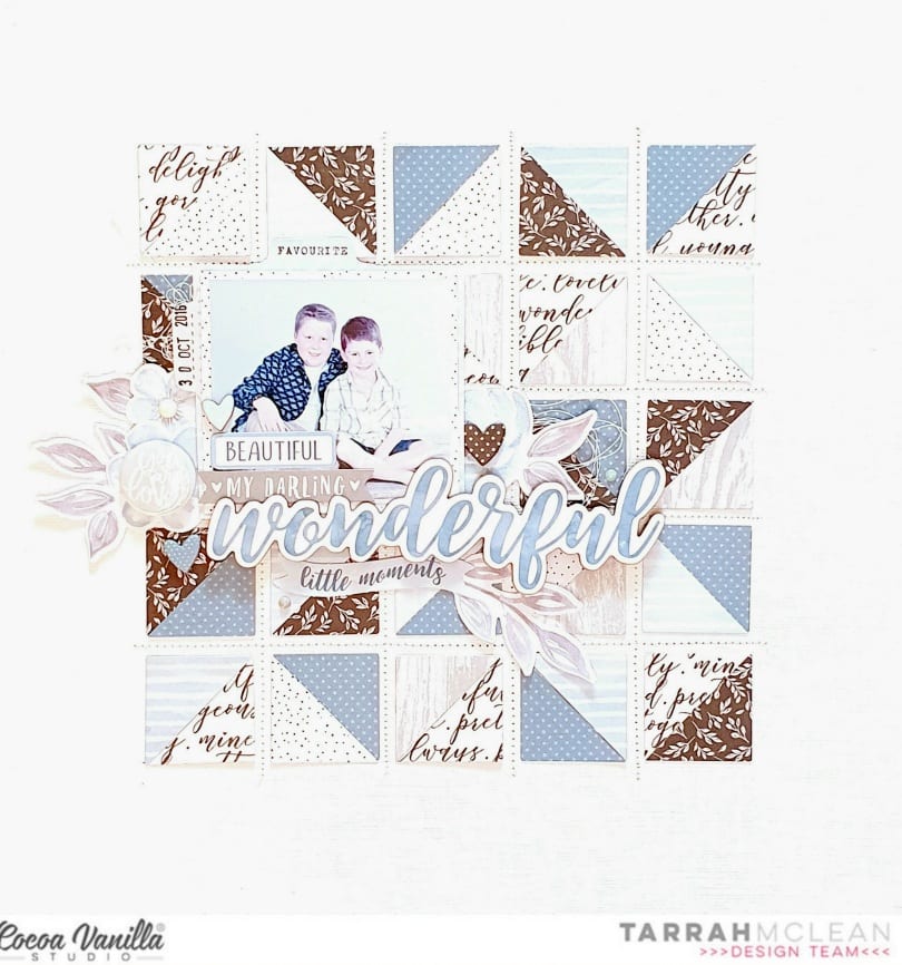
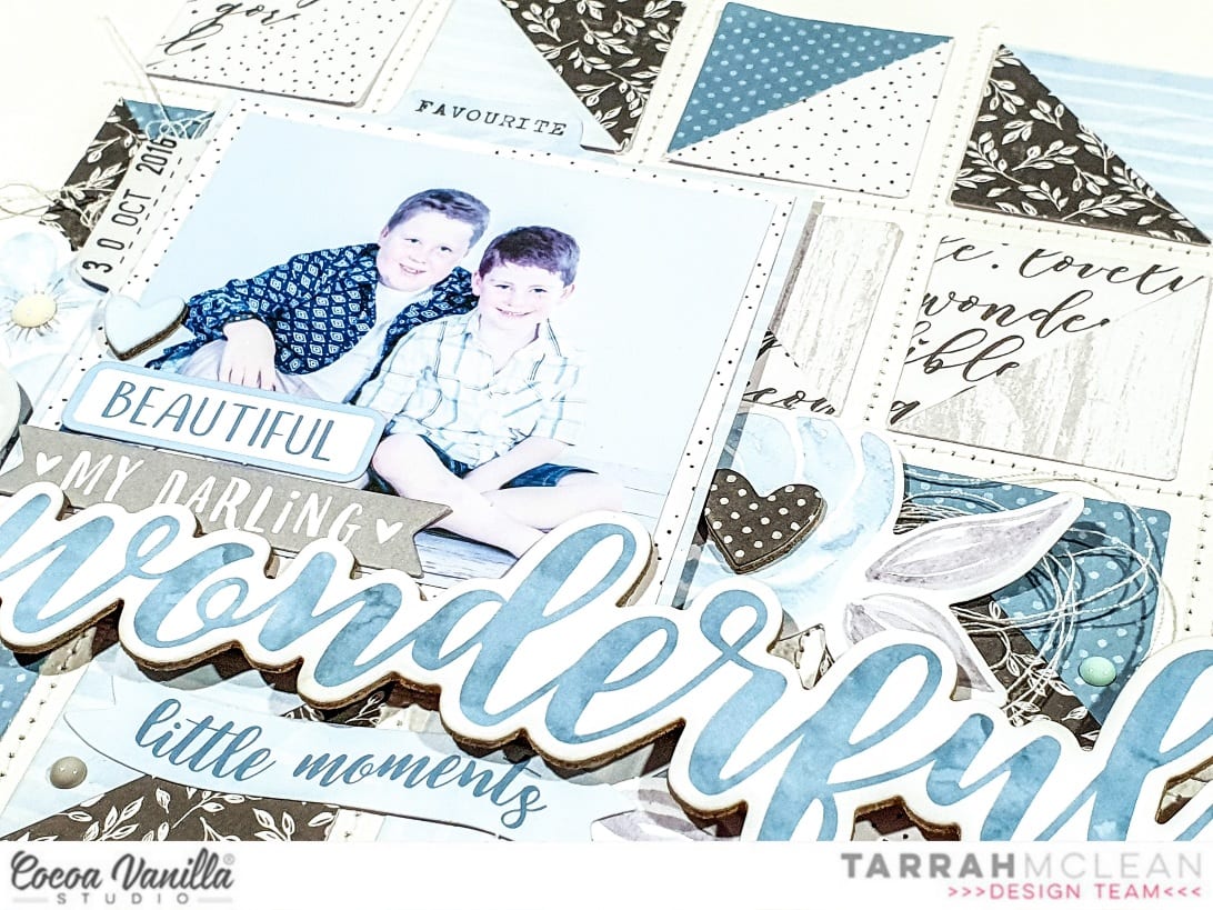
I wanted to create a striking design using a few of the different patterned papers from the More Than Words collection. As my layout has a photo of my 2 boys, I punched 1 inch squares from the blues, greys and black papers in the 6' x 8' paper pad to create a masculine colour scheme. Once punched out, I cut them all in half diagonally to make triangles, I then started adhering them back into squares onto a plain white cardstock background, mixing the colours and designs so the squares each had a different pattern and colour.
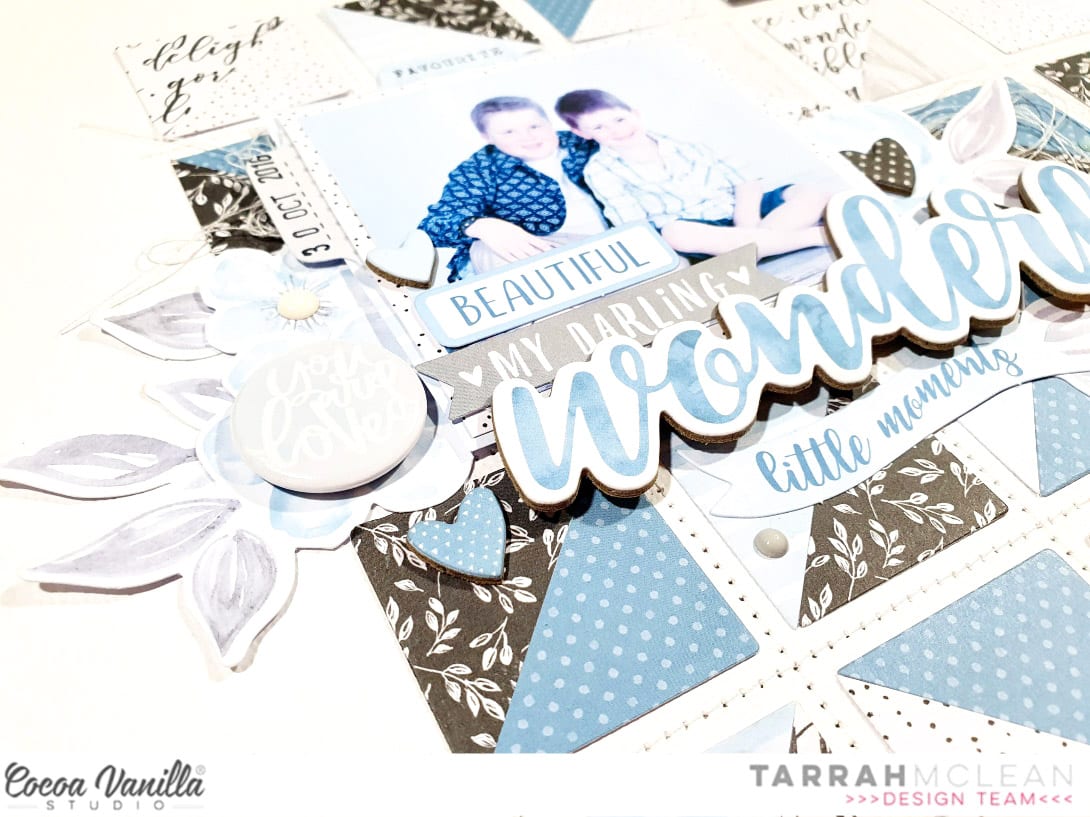
Once I was happy with the design of the background, I machine stitched vertically and horizontally in between all the squares using a white thread to add more texture to the background!
I matted the photo using 3 of the patterned papers and then adhered it down to my page with craft foam underneath. I layered a couple of die-cut phrases from the ephemera pack on top of my photo and chose and placed the Wonderful chipboard title in place under the photo.
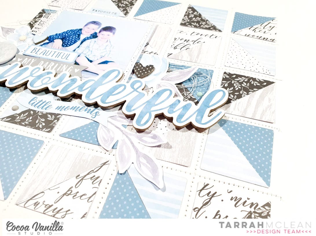
I took some of the blue coloured die-cut flowers and created 2 embellishment clusters tucking them into both sides of the photo. I added some other embellishments to the die-cuts including a flair button, a chipboard heart and some enamel dots. I also wanted to add even more texture so I gathered some white thread and tucked some under the flowers on both sides of the photo.
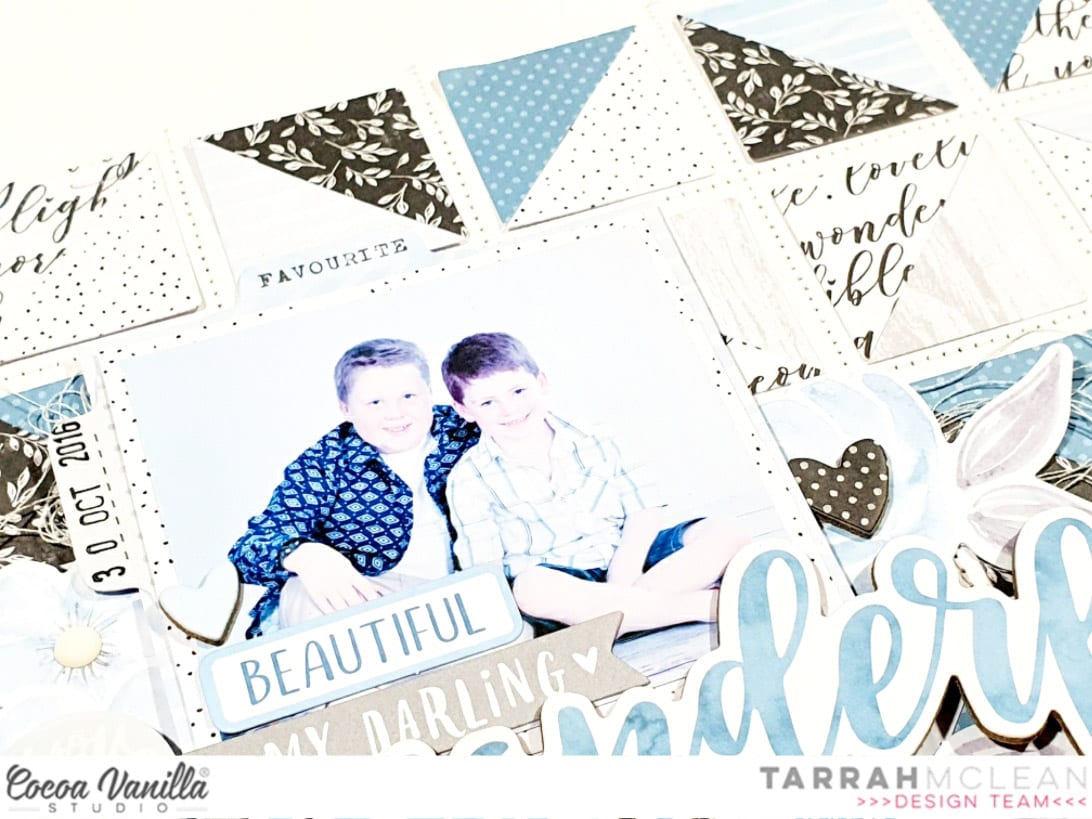
Lastly I added a few more enamel dots, phrase accessory stickers, chipboard hearts and tab die-cuts.
Thank you so much for stopping by my blog today! I hope you found some texture inspiration from my layout.
Happy creating!
Tarrah x
No comments:
Post a Comment